The Art of Web Design: Essentials Elements to Create Engaging Designs
Web design can make or break a website. Web designers have the power to make websites look beautiful, modern, and user-friendly. Web design is an art form that needs a lot of creativity. Web designers are often tasked with creating aesthetically pleasing designs on tight deadlines and limited budgets.
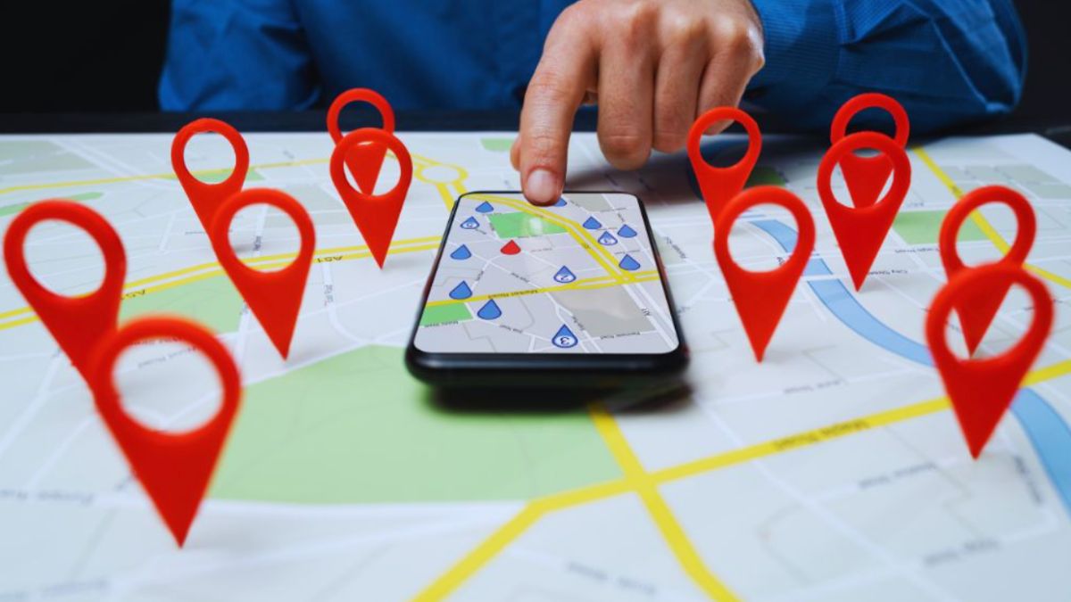
The information age values user data from various locations on the internet. Having a website with interaction design can help businesses advertise their services to a broad group of people that may want to avail of your services.
The World Wide Web contains many websites, may it be an old or new website. Out of all those websites, you’ll want to stand out from the rest so your target user group can find you.
This article will cover 10 essential web design elements that you need for your next project!

How Does Web Design Work?
Web development involves several processes to create websites that are not time-consuming to load. This allows users to browse the site with ease.
The task of designing a web page includes conceptualizing, planning, and arranging content online. Modern websites go beyond aesthetics to include functionality as well. The concept of web design encompasses web applications, mobile apps, and user interface design as well.
Do you know that web design greatly influences how well you perform with search engines like Google? Hopefully, while reading this article, you will gain some useful insight into designing a website that will look good and work well and rank highly in searches as well.
What Is the Role of a Web Designer?
It is a web designer’s job to handle the appearance and layout of a website and its content in some cases. As an example, appearance is determined by the color, font, and image used in website designs. Information is categorized and structured based on its layout design.
An ideal website design is user-friendly, aesthetically pleasing, and suited to the business and target audience. Many web pages are designed to be simple and easy to navigate so that the user won’t be overwhelmed by information and functionality that might distract them or confuse them.
Since a web designer’s primary goal is to design a site that targets the right audience and inspires trust, taking steps to eliminate potential points of user frustration are critical.
Why Do You Need SEO Website Design?
When designing an SEO web page, a web developer considers how a site will appear on search engine results pages. A website designed with both website design and SEO can be easily analyzed by search engines such as Google.
It takes a lot of considerations to design an SEO-friendly website. For example, page headings should clearly state what the page is about and not require internal links in order to be visible.
Throughout the text of your website, the keyword in the title tag should be repeated as many times as possible without sounding too repetitive or garish. In order to create an effective web design that incorporates SEO, there are several things to keep in mind.
Does Web Design Impact Search Engine Optimization?
Web design serves as a way to share your company’s message with its customers.
Putting SEO keywords into your web design will help search engines understand what your company stands for or what key phrases you want them to use.
Having a well-structured website will also make it easier for visitors to navigate and find the information they are looking for quicker and easier.
Before contacting the company in a professional setting, customers will feel more comfortable with the website’s development.
Web Design: Elements of a Website
Taking both appearance and function into consideration is vital when designing a website. The site’s overall performance and usability will be improved by integrating these elements. A user-friendly interface, graphics and images, well-written and correctly placed text, and a color scheme all contribute to your site’s usability. Your site’s performance is measured in terms of its speed, ranking, searchability, and audience capturing ability.
Web Design Visual Elements
The appearance of your website and its text depend on each other fundamentally. In order to create a web design that is cohesive with balanced components, your designers and writers should work together. Complement your graphics and images (and other multimedia) with chunks of text (text blocks).
Choosing a Font
Make sure your font complements the design. Choosing the right font for your website will compliment your color scheme and graphics, as well as enhance the overall tone. There are tools like Canva’s Font Combinator that you can use to find the perfect font match. Several font pairings are included in web design tools like PageCloud.
Choosing Colors
Color is an essential element when designing a website. Remember that there are many misconceptions about colors, so be sure to choose colors that complement your website’s overall tone and design. Consider the message you want to convey to your audience and the color scheme you are using. Many design trends use different styles and colors to fit the overall design of the business brand.
Page Layout
A site’s usability and functionality are significantly impacted by how its content is organized. Choosing a layout is not governed by any particular rules, but there are some general principles that you should remember. Don’t use an overstimulating layout that might distract your target audience from the message you want to convey. Your target audience should be taken into consideration.
Combining Shapes
A web design that integrates graphic elements can create a seamless integration of text and images, as well as enhance the site’s visual appeal. Color and shape combinations can help direct visitors’ attention to your site and improve the overall flow of your site.
Appropriate Spacing
In order to create visually appealing and intuitively navigable websites, spacing is vital. There will be some element of spacing in every design element. Whitespace is an essential part of achieving a perfect balance between text, photos, and graphics. It is important to keep your spacing consistent so that users can navigate your website easily. In modern web design, whitespace is a key concept.
Choosing Images and Icons
Design is an art that can communicate a lot of information in a matter of seconds. Digital media can help in the creation of businesses’ websites. In this case, a powerful image and icon make this possible. Your message should be supported and strengthened by the images and icons you choose. Many thousands of stock images and icons can be found by performing a quick Google search.
Use Videos
Many web designers are increasingly integrating videos into their designs. Using video to explain a message which cannot be adequately communicated through text or images can be quite helpful when used properly. Visitors’ eyes will be drawn to moving images, just like in a restaurant with a TV screen. Ensure that your videos do not compete with or distract from other important elements.
Web Design Functional Elements
When designing a website, these functional elements should not be overlooked. You need a website that works properly if you want your users to have the best possible experience and to rank highly on search engines.
Website Navigation
Your website’s navigation is one of the main factors that determine how well it operates. You can use the navigation to serve different purposes, depending on your audience: helping new visitors discover what your site offers, giving easier access to your pages to returning visitors, and improving their overall experience.
User Interactions
Depending on the device they use, visitors to your site can interact with it in various ways (scrolling, clicking, typing, etc.). User interactions should be simplified to give the user the feeling that they are in control of the site. Focus on a user experience design that gives a vast majority of site visitors to explore different aspects of your website. The following are a few examples:
- Auto-playing audio or video is never a good idea
- Unless the text is clickable, do not underline it
- Check to see if your forms are mobile-friendly
- Avoid pop-up ad
- Scrolljacking should be avoided
Using Animations
Your design can be enhanced with web animation techniques that will draw the attention of your visitors and provide opportunities for interaction. A “like” button or form can, for instance, keep your visitors engaged. Keep your animations simple if you’re a beginner to prevent developer intervention.
Website Speed
Having a slow-loading website isn’t good for business. A visitor can quickly become disenchanted with your website if they have to wait longer than a few seconds for the page to load. If your site does not load quickly, regardless of how beautiful it is, it will not compete well in search results (i.e., do not rank highly on Google).
Content is typically compressed by leading site builders to speed up load times, but no guarantees are made. If you intend to have content on your website, make sure to check out which site builders will work well with it.
Website Structure
The structure of a website makes a significant difference between search engine optimization (SEO) and user experience (UX). You should have no structural issues preventing your users from easily browsing your website. If users are having trouble navigating your site, it is likely that “crawlers” will also have difficulty. An automated program called a web crawler (or bot) investigates your website and determines its functionality. A poor navigation experience can negatively impact a site’s ranking and user experience.
Compatible With All Browsers and Devices
Good design looks great across all devices and browsers (including Internet Explorer). In order to make this tedious process quicker and easier, it’s recommended to use a cross-browser compatibility testing tool when building your site from scratch. On the other hand, if you are creating a website with a custom builder, cross-browser testing is often handled by the development team in the company, which allows you to focus on the design.
Web Design Types: Responsive and Adaptive
Adaptive and responsive web design are two of the most popular methods for designing websites that work on desktop and mobile devices.
By understanding the advantages and disadvantages of responsive and adaptive websites, you will be able to choose which website builder is the best fit for your website design requirements.
Across the internet, you’ll probably come across articles that describe a whole variety of website design styles (fixed, static, fluid, etc.). As a result, there are only two website styles that should be used today to create a mobile-friendly website: adaptive and responsive.
Adaptive Design
With adaptive web design, the website is created in two or more versions according to the screen size. There are two basic types of adaptive websites based upon how they determine the size to display:
1. Adapts Depending on the Type of Device
When you connect to a website, your browser will send an HTTP request that includes a field called “user-agent” that tells the server the type of device attempting to view the page. Adaptive websites will be able to determine what version of the site to display according to the type of device reaching them (i.e., desktop, mobile, tablet). Using a desktop computer will cause problems if you shrink the browser window because the page will not shrink to match the new size but instead keep the desktop version.
2. Adapts Based on the Width of the Browser
Rather than using “user-agents,” the website switches between versions using media queries (a CSS feature that allows a webpage to adapt to different screen sizes) and breakpoints (certain widths). The widths of the versions will be 1080px, 768px, and 480px instead of desktop, tablet, and mobile. As your site will adapt to the width of the screen, it will offer more flexibility for designing, as well as a better viewing experience.

Responsive Design
In responsive websites, elements are positioned in a flexible grid layout based on the percentage of the container. If one element (e.g., a header) is 25% of the container, then that element will remain at 25% regardless of screen size. Responsive websites can also use breakpoints to deliver a special look on every screen size. However, they constantly adapt to fit the current screen size, rather than adaptive sites that adapt only when they reach a breakpoint.
Web design may look easy, and you might think that you can do your website design by yourself, but website development features a lot of work not to mention skills and knowledge to successfully create websites that both look good and function well. Thinking of investing in your business’ web design? Do not hesitate to contact us Vanguard Online Marketing if you need help!
Learn More About:
Web Design Services We offer
Web Design Services